1280x1024 1600x1200  


Bold
web design

Orange Label work is remembered for its informal, innovative design. We approach every project individually, taking every wish into account.
Our new promo site “Everyone on velcom!” proves our passion for originality and creativity at first glance.

Convincing
results

The Orange Label portfolio includes more than five hundred projects. Eight years of work have given us the experience to solve any task — and prestigious awards prove it: our Water Empire logo was recognised by the respected LogofromDreams.

Creative
approach

Orange Label designers never think in templates — they bring a special twist to every project they work on.
The 3D icons for SIPNET were our own initiative, and soon became the envy of many other websites.

 
More
documents

Learn more about how we work. Fill in a brief to send us a request.

 
Company profile Website development brief
     
A little
about us

We started out in 2000, and since then one thing has stayed the same: perfectionism and an endless pursuit of the ideal.

We do web design, website development, logo design and graphic design. Since the studio was founded we have completed more than five hundred projects. Today clients from over twenty-five countries trust us with complex and unconventional tasks. Promo sites, large portals, illustrations, icons, logos and interface solutions: our portfolio tells best what we do.

Want to know more about our company, our projects and how we could work together? Contact your nearest Orange Label representative to discuss your project in detail:

+7 926 2897111 Moscow
+375 29 2630918 Minsk
+420 775 619415 Prague
contact@orangelabel.com


Website
development


Promo website development
Alivaria

promo site

Before launching its “Extra” beer, the Alivaria brewery decided to ask consumers what the new bottle should look like. Commissioned by the BTL agency PR2, Orange Label designed a promo site where Alivaria presented its new product in an interactive way.

A successful site concept, attractive photography and a bright colour scheme helped a quality product enter the market, where it enjoys well-deserved demand.


Everyone on velcom!

promo site

visit the site: www.vsenavelcom.by
In summer 2008 the mobile operator velcom ran a big concert tour across Belarus. Commissioned by the BTL agency PR2, we designed a promo site for the upcoming tours, where subscribers voted for which artists would come to their town. Visitors could see the line-up, read about each performer and find out the concert dates. velcom highly appreciated the design of the project, made in a modern youth style.
When the new “Everyone on velcom” tariff plan was launched, the structure and look of the project’s home page were changed.
Promo website development Promo website development


Prestigio Plaza

online store

The Prestigio Plaza online store sells exclusive products from the world’s leading manufacturers: computers and home appliances, clothing and books, interior pieces and works of art. You won’t find ordinary goods here — Prestigio Plaza customers know the value of true quality.
The main idea behind the PrestigioPlaza store design is classic minimalism. High-resolution photos on a black background are the best advertising for the goods. Unlike other online stores, this site has a minimum of accompanying text. No need for extra words — let the brands speak for themselves.


London studio

website development

London studio produces audio and video: commercials, music videos, staged photo shoots, film dubbing and music albums. Working on the London studio website, we set out to stress the company’s high professional level and serious capabilities.
The virtual reception created by our designers helps the studio’s clients find their way and pick exactly what they need from a long list of services. The site uses a calm colour palette, and the combination of elegant design, neatness and simplicity puts visitors in a businesslike mood.
     
 
Prophotos.ru

website design

visit the site: www.prophotos.ru

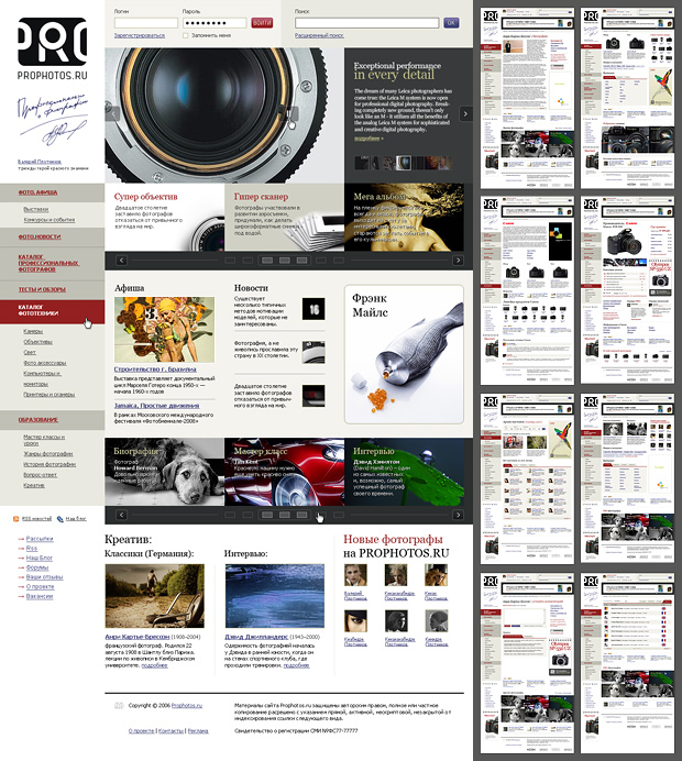
Prophotos.ru was launched as the first online glossy magazine about photography. Thanks to accessible writing, a wide range of topics and great design, the site quickly became a leading resource for professional and amateur photographers. Working on Prophotos.ru, we created more than 40 layouts, the logo, and the design of the home and inner pages. Our team also designed styles for the Prophotos_ru community on LiveJournal and many other services of the project.

What is the hardest part of working on sites like this? Right — knowing when to stop. Carried away by decoration, you can lose the very thing a photo site exists for: the beauty of the works on show. We managed to keep the balance. The strict, intelligent design only brings out the best in the photographs. Careful, painstaking work on structuring the information, separating the essential from the secondary, helped a lot. Our efforts paid off. Prophotos.ru lives and grows, and in a short time it reached 15,000 visitors a day.

Website design Web design


A4Tech X7

website development

A4 makes a wide range of computer peripherals for every taste. One of its priorities is gear for professional gamers — no wonder A4 is a regular sponsor of WCG and many other e-sports events in Russia and abroad. The campaign “Become the Daddy with the X7 mouse” was designed to draw extra attention to the company’s products.
Bold design, Flash animation and an unconventional approach made this site truly memorable. Complete product information helps gamers make the right choice and pick the X7 as their “main weapon” in virtual battles.


Logo design
and corporate identity


Water Empire

logo

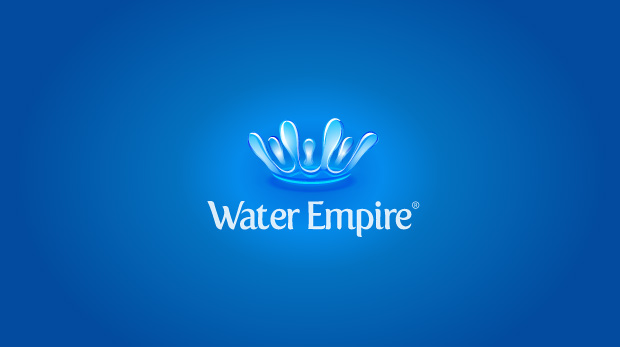
When the mineral water producer Water Empire ordered a logo, it asked us to stress the solidity and substance present in its name. At the same time the logo had to be clearly associated with drinking water. Our designers took the task very seriously.

In the end we offered the client a crown of water splashes combined with unusual lettering. The idea fully met the client’s requirements, and the logo turned out memorable and recognisable. Our peers appreciated it too: the Water Empire emblem was named “Logo of the Day” on logofromdreams.com


Sony Ericsson Club

logo design

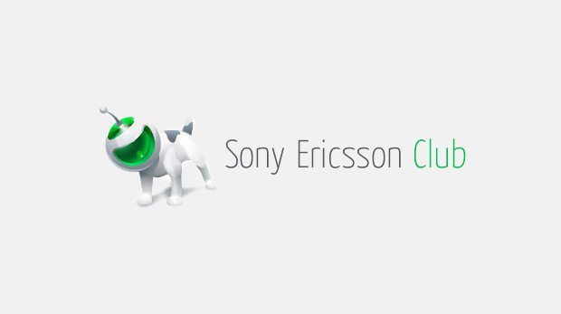
Designing a logo for a club of Sony Ericsson mobile fans, we tried to convey the warm, friendly atmosphere among like-minded people. The client chose this little dog in a funny helmet symbolising the Sony Ericsson brand. It reflects the manufacturer’s concept of combining reliability, advanced technology and user-friendliness.


My Guest House

logo

MyGuestHouse develops software that automates the business of small hotels and guest houses, and the client wanted the logo to focus on exactly that.

A key-ring flash drive that looks like a cosy little house became the right image for the logo of this software product. The client’s main lines of business are easy to read in it.

Logo design Logo design


Vostok

corporate identity

Vostok, a medical logistics company, came to us for a logo and corporate identity. The client wanted to stress not only the firm’s solid business reputation but also its optimism and focus on the future. The task became a creative challenge for our designers, who proposed dozens of graphic options.
The management chose a sun symbol, on which the whole corporate identity was later built. We achieved a modern graphic solution for the logo, and well-chosen lettering underlines the laconic layouts and rich colour combinations.
     
 
Soldis Capital

logo design

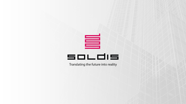
Soldis Capital designs and builds office buildings in Australia, and we put the key aspects of its business into the logo.

The mark is based on a zigzag line that recalls both a high-rise under construction and the “snake” from the famous computer game. The client loved this combination of strength and flexibility. The “foundation” of the logo is a typeface Orange Label designers created specially for this project, which makes the mark look solid and complete.


AERA

corporate identity

Aera works in contextual advertising on the Russian internet. Inspired by the lightness and airiness in its name, we designed a dynamic, “flying” typeface for the logo.
The corporate identity, based on white and sky blue, also aims to give the company’s clients a feeling of lightness and a good mood.


BMC

corporate identity

visit the site: www.baltmetcompany.ru
The fast-growing Baltic Metallurgical Company came to Orange Label with a far from simple order: building on what they already had, they wanted to completely renew their corporate identity.
Following the client’s wishes, we modernised the logo and the corporate typeface, reworked the document and business card templates, changed almost every item of promotional material and even the staff uniforms. The result met every expectation: the company kept its recognisability while its image became more modern and memorable.


Icon design
and illustration


Mp3sale.ru

characters

The music portal Mp3sale is one of the best-known sources of audio files. The project team came to Orange Label with an unusual request: to invent characters to decorate their payment cards. Starting from the site design, whose symbol is a vinyl record, our artists created these cute little people.
Each of them stands for a music genre and resembles a famous musician. Today this cheerful “band” is as much a part of the Mp3sale design as anything else.


SIPNET

3D icons

Sipnet is the largest IP telephony provider in Russia. While redesigning its website, the client decided to use bright, eye-catching icons. We tried a new approach: the icons were drawn entirely in Adobe Illustrator.
Using only vector graphics, our artists managed to render the play of shadows on even the smallest details. The experiment was so successful that now every third client asks for something similar — and we are happy to oblige, as long as it fits the overall concept of the site.


sms.kopilka

icon design

visit the site: www.smskopilka.ru
Launched three years ago, not without our design help, SMS-Kopilka became the most popular service for website owners on the Russian internet. SMS piggy banks are now part of thousands of web pages. For this project we designed the main character — a cute piggy bank.
Over the years its pink snout has become as recognisable as the ICQ flower. Later Orange Label designers and artists created a whole series of funny characters for SMS piggy banks, so the owner of any kind of site can pick one to their taste.


Shurf

icons

The Shurf rock festival takes place every year in Voronezh. Working on the new design, our team broke with convention and decided to change the standard brutal image of rock musicians. Instead of dark backgrounds and loud colours we used a crumpled paper effect, styling the site as a creative person’s notebook.
The concept was perfectly complemented by icons made as ink drawings — maybe not very skilful, but diligent. The bold experiment was warmly received by the client and by the festival musicians themselves: many of them really do doodle in the margins while writing lyrics or composing music.


DeltaVec

icons

For the CMS of the DeltaVec financial portal we designed a series of simple, informative icons. Unlike the bright, graphics-heavy portal, a CMS has different requirements: it must load fast and be convenient for everyday use.
So the concept here was functionality. Steering clear of heavy colour and excessive detail, our designers created a series of outline pictograms. The client highly appreciated their clarity, functionality and unusual design.


Soundike

icons

visit the site: www.soundike.com
The Klondike River area was once the most coveted place for gold seekers from all over the world. Today the music portal Soundike aims to become the most popular place for music lovers.
With a name and philosophy like that, it’s no surprise that the Soundike icons were styled as a gold digger’s gear: a pick, a shovel, a chest and, of course, the gold itself.


Orange Label offices
Moscow
Galina Adams
Moscow, Russia
+7 926 2897111
moscow@orangelabel.com
Minsk
Polina Tsarik
Minsk, Belarus
+375 29 2630918
contact@orangelabel.com
Prague
Denis Protsenko
Prague, Czech Republic
+420 77 5619435
orange@orangelabel.com
Kaliningrad
Alexey Stepanov
Kaliningrad, Russia
+ 7 906 2391773
as@orangelabel.com
     
Write
to us
     

You will need to turn on javascript in your browser to run our web-site